
You are using an out of date browser. It may not display this or other websites correctly.
You should upgrade or use an alternative browser.
You should upgrade or use an alternative browser.
TomScott @ Silverstone Classics 2013 *UPDATED* Day 1&2
- Thread starter tomscott
- Start date
neilthomas
Member
Amazing pics Tom! 
shotbybothsides
Member
Excellent work Tom,
I really like what you do to the highlights. Is this a global curves adjustment in your processing or do you have a plug in or action for this? If it's a trade secret and you'd rather keep it that way, I do understand.
I really like what you do to the highlights. Is this a global curves adjustment in your processing or do you have a plug in or action for this? If it's a trade secret and you'd rather keep it that way, I do understand.

Haha its not a trade secret just something I like to do. But thanks for noticing! Subtle but really makes the car pop.
But to answer your question I have preset adjustment brushes that I make. The wonderful thing about Lightroom. I have lots of them to emphasise different aspects of the car. Headlights, number plates etc
Because it was such a bright day the dynamic range was huge from the darkest shadow to the lightest highlight. Impossible for the camera to capture the full range. One way to equalise is to use a flash but I couldn't be bothered to run around all day with a flash. So the easy way is to underexpose by around a stop, gives detail in the sky and increases shadows. A lot of the time I will shoot with editing in mind, with having two cameras with two lenses its enough to carry without flashes extra filters etc Cameras like the 5DMKIII are so good that you can get away with doing this, but its not the way I would shoot commercially as it increases noise and decreases sharpness, but the images have come out great and making big prints wouldnt be a problem. So its a good way to work when the weather is working against you.
Its easier to recover shadows than highlights, when recovering blown highlights the result will be flat and the gradation of colour creates an unnatural grey colour. So when processing the image I will increase the shadows a stop which should equalise the exposure. But its was very very bright that day so I had to recover the highlights a little. When you recover highlights it usually reduces the contrast globally across the image and by recovering both shadows and highlights it adds an unwanted HDR effect which I cant stand. If you add a curve or contrast adjustment it will undo the highlight recovery by adding more contrast and looking less natural and the gradation in the sky from grey to white will turn even more choppy. Although I prefer a more contrasty image, there are different styles of contrast. I process a little more on the warmer vibrant side because thats just the way I like it
But there is now the clarity slider which adds contrast to the edges, it adds real dimension and I love it!
For the headlights I create a brush with positive clarity, positive highlights a little contrast, sometimes a little exposure too depending on the image and paint the headlights. Makes them really stand out. The Z headlights are so distinctive and I think this makes them more true to life, in pics they look flat and lack dimension whereas in real life they are very dimensional, I think this brush accentuates it. Which after all that gumf answers your question lol
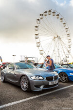
Heres an example where I have done it on my car.
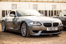
BMW E86 Z4M Coupe, Z-Fest, Silverstone Classics 2013 by TomScottPhoto, on Flickr
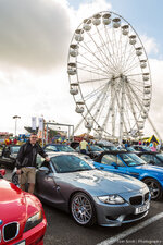
And forgot to do it on this car
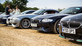
BMW E86 Z4M Coupe, Z-Fest, Silverstone Classics 2013 by TomScottPhoto, on Flickr
Another problem with recovering highlights is the number plates usually go a weird dark HDR colour with a look that is completely unnatural. You can see above I have forgotten to do it on the image of my car. Again it is to do with reducing the amount of colours that make up the gradient but its also to do with number plates reflective quality. So what I do is make a brush with increased exposure and add clarity this really isolates each letter because usually they are quite small in the image. When clarity adds contrast to the edge it will cover the whole letter because they are so thin. So this also makes the car look more natural.
Like with all editing, its a fine balance between realism and the intended style. With mine I intend to create the original look but accentuate it and adding more dimension and warmth.
Another secret is I spend ages on each image removing distractions and at car shows there are hundreds. This image is a good example.
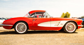
TSP_SC (71 of 333) by TomScottPhoto, on Flickr
There were quite a lot of people in the background and the texture on the floor was very uneven and really distracted the eye. By removing them you can really concentrate on the car, but not too much if I removed every stone it wouldn't look right.
This one was made up to two images, I was kneeling on the floor waiting for this guy to move that was looking at the car, but he spent a long time looking at it so I snapped two images one with him toward the rear and another when he had made his way around to the front. I then combined them to remove him from the image. I have just noticed I havent removed his refletion on the front wing. But if I hadnt said you probably wouldn't have noticed
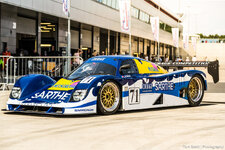
TSP_SC (244 of 333) by TomScottPhoto, on Flickr
Obviously with 300 images and I was late getting them done anyway. I didn't spend that much time as I usually would because the likelihood of me selling any of these images is quite slim, and I do it more for everyone on the forum that wasn't there to get a feel of the event.
Still have another 300 to do
But to answer your question I have preset adjustment brushes that I make. The wonderful thing about Lightroom. I have lots of them to emphasise different aspects of the car. Headlights, number plates etc
Because it was such a bright day the dynamic range was huge from the darkest shadow to the lightest highlight. Impossible for the camera to capture the full range. One way to equalise is to use a flash but I couldn't be bothered to run around all day with a flash. So the easy way is to underexpose by around a stop, gives detail in the sky and increases shadows. A lot of the time I will shoot with editing in mind, with having two cameras with two lenses its enough to carry without flashes extra filters etc Cameras like the 5DMKIII are so good that you can get away with doing this, but its not the way I would shoot commercially as it increases noise and decreases sharpness, but the images have come out great and making big prints wouldnt be a problem. So its a good way to work when the weather is working against you.
Its easier to recover shadows than highlights, when recovering blown highlights the result will be flat and the gradation of colour creates an unnatural grey colour. So when processing the image I will increase the shadows a stop which should equalise the exposure. But its was very very bright that day so I had to recover the highlights a little. When you recover highlights it usually reduces the contrast globally across the image and by recovering both shadows and highlights it adds an unwanted HDR effect which I cant stand. If you add a curve or contrast adjustment it will undo the highlight recovery by adding more contrast and looking less natural and the gradation in the sky from grey to white will turn even more choppy. Although I prefer a more contrasty image, there are different styles of contrast. I process a little more on the warmer vibrant side because thats just the way I like it
But there is now the clarity slider which adds contrast to the edges, it adds real dimension and I love it!
For the headlights I create a brush with positive clarity, positive highlights a little contrast, sometimes a little exposure too depending on the image and paint the headlights. Makes them really stand out. The Z headlights are so distinctive and I think this makes them more true to life, in pics they look flat and lack dimension whereas in real life they are very dimensional, I think this brush accentuates it. Which after all that gumf answers your question lol
Heres an example where I have done it on my car.
BMW E86 Z4M Coupe, Z-Fest, Silverstone Classics 2013 by TomScottPhoto, on Flickr
And forgot to do it on this car
BMW E86 Z4M Coupe, Z-Fest, Silverstone Classics 2013 by TomScottPhoto, on Flickr
Another problem with recovering highlights is the number plates usually go a weird dark HDR colour with a look that is completely unnatural. You can see above I have forgotten to do it on the image of my car. Again it is to do with reducing the amount of colours that make up the gradient but its also to do with number plates reflective quality. So what I do is make a brush with increased exposure and add clarity this really isolates each letter because usually they are quite small in the image. When clarity adds contrast to the edge it will cover the whole letter because they are so thin. So this also makes the car look more natural.
Like with all editing, its a fine balance between realism and the intended style. With mine I intend to create the original look but accentuate it and adding more dimension and warmth.
Another secret is I spend ages on each image removing distractions and at car shows there are hundreds. This image is a good example.
TSP_SC (71 of 333) by TomScottPhoto, on Flickr
There were quite a lot of people in the background and the texture on the floor was very uneven and really distracted the eye. By removing them you can really concentrate on the car, but not too much if I removed every stone it wouldn't look right.
This one was made up to two images, I was kneeling on the floor waiting for this guy to move that was looking at the car, but he spent a long time looking at it so I snapped two images one with him toward the rear and another when he had made his way around to the front. I then combined them to remove him from the image. I have just noticed I havent removed his refletion on the front wing. But if I hadnt said you probably wouldn't have noticed
TSP_SC (244 of 333) by TomScottPhoto, on Flickr
Obviously with 300 images and I was late getting them done anyway. I didn't spend that much time as I usually would because the likelihood of me selling any of these images is quite slim, and I do it more for everyone on the forum that wasn't there to get a feel of the event.
Still have another 300 to do
shotbybothsides
Member
I'm really grateful for this Tom, so much inspiration, I have a lot to learn
Some cracking shots there You made IMmie look blood red!
You made IMmie look blood red!
Day 2
We were there very early got right in front of the BMW stand. Light got better through the day sorry for a little repetition I'm sure you don't mind!
Link to the full set
http://www.flickr.com/photos/tomscottphotography/sets/72157635105306341/
TSP_SC (334 of 191) by TomScottPhoto, on Flickr
TSP_SC (337 of 191) by TomScottPhoto, on Flickr
TSP_SC (335 of 191) by TomScottPhoto, on Flickr
TSP_SC (336 of 191) by TomScottPhoto, on Flickr
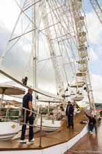
TSP_SC (338 of 191) by TomScottPhoto, on Flickr
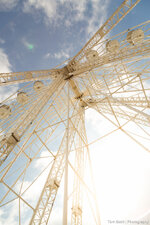
TSP_SC (339 of 191) by TomScottPhoto, on Flickr
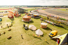
TSP_SC (340 of 191) by TomScottPhoto, on Flickr
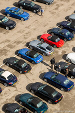
TSP_SC (341 of 191) by TomScottPhoto, on Flickr
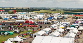
TSP_SC (342 of 191) by TomScottPhoto, on Flickr
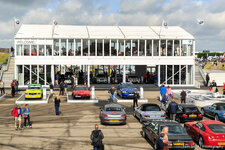
TSP_SC (343 of 191) by TomScottPhoto, on Flickr
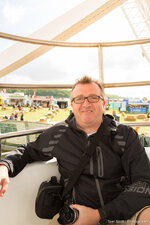
TSP_SC (344 of 191) by TomScottPhoto, on Flickr
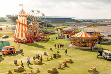
TSP_SC (345 of 191) by TomScottPhoto, on Flickr
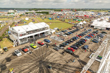
TSP_SC (346 of 191) by TomScottPhoto, on Flickr
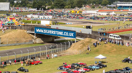
TSP_SC (347 of 191) by TomScottPhoto, on Flickr
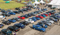
TSP_SC (348 of 191) by TomScottPhoto, on Flickr
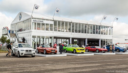
TSP_SC (349 of 191) by TomScottPhoto, on Flickr
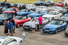
TSP_SC (350 of 191) by TomScottPhoto, on Flickr
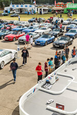
TSP_SC (351 of 191) by TomScottPhoto, on Flickr
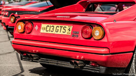
TSP_SC (352 of 191) by TomScottPhoto, on Flickr
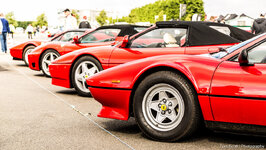
TSP_SC (353 of 191) by TomScottPhoto, on Flickr
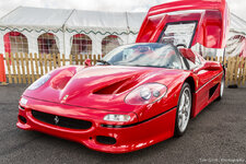
TSP_SC (354 of 191) by TomScottPhoto, on Flickr
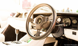
TSP_SC (355 of 191) by TomScottPhoto, on Flickr
TSP_SC (356 of 191) by TomScottPhoto, on Flickr
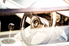
TSP_SC (357 of 191) by TomScottPhoto, on Flickr
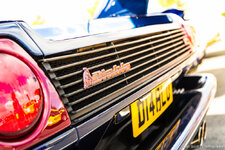
TSP_SC (358 of 191) by TomScottPhoto, on Flickr
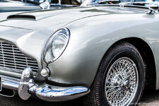
TSP_SC (359 of 191) by TomScottPhoto, on Flickr
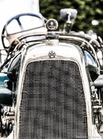
TSP_SC (360 of 191) by TomScottPhoto, on Flickr
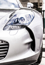
TSP_SC (361 of 191) by TomScottPhoto, on Flickr
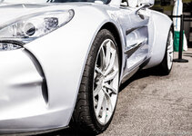
TSP_SC (363 of 191) by TomScottPhoto, on Flickr
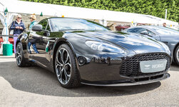
TSP_SC (364 of 191) by TomScottPhoto, on Flickr
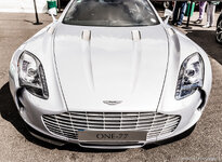
TSP_SC (366 of 191) by TomScottPhoto, on Flickr
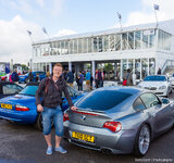
TSP_SC (367 of 191) by TomScottPhoto, on Flickr
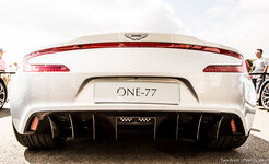
TSP_SC (369 of 191) by TomScottPhoto, on Flickr
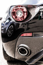
TSP_SC (370 of 191) by TomScottPhoto, on Flickr
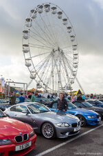
TSP_SC (371 of 191) by TomScottPhoto, on Flickr
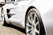
TSP_SC (373 of 191) by TomScottPhoto, on Flickr
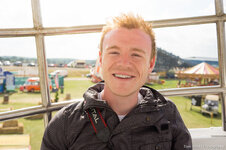
TSP_SC (374 of 191) by TomScottPhoto, on Flickr
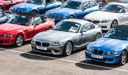
TSP_SC (376 of 191) by TomScottPhoto, on Flickr
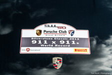
TSP_SC (378 of 191) by TomScottPhoto, on Flickr
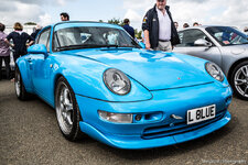
TSP_SC (380 of 191) by TomScottPhoto, on Flickr
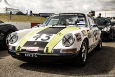
TSP_SC (381 of 191) by TomScottPhoto, on Flickr
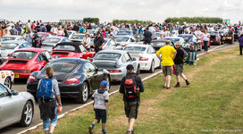
TSP_SC (382 of 191) by TomScottPhoto, on Flickr
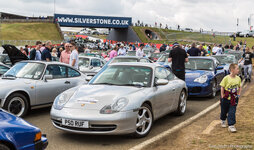
TSP_SC (383 of 191) by TomScottPhoto, on Flickr
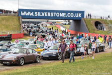
TSP_SC (384 of 191) by TomScottPhoto, on Flickr
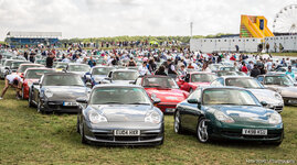
TSP_SC (385 of 191) by TomScottPhoto, on Flickr
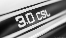
TSP_SC (386 of 191) by TomScottPhoto, on Flickr
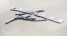
TSP_SC (387 of 191) by TomScottPhoto, on Flickr
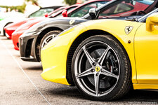
TSP_SC (388 of 191) by TomScottPhoto, on Flickr
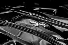
TSP_SC (389 of 191) by TomScottPhoto, on Flickr
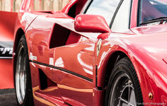
TSP_SC (390 of 191) by TomScottPhoto, on Flickr
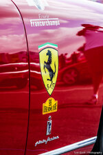
TSP_SC (391 of 191) by TomScottPhoto, on Flickr
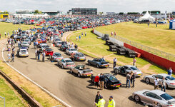
TSP_SC (392 of 191) by TomScottPhoto, on Flickr
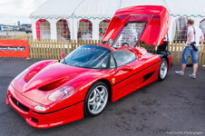
TSP_SC (393 of 191) by TomScottPhoto, on Flickr
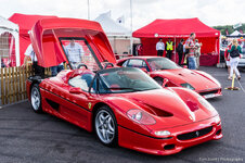
TSP_SC (394 of 191) by TomScottPhoto, on Flickr
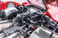
TSP_SC (395 of 191) by TomScottPhoto, on Flickr
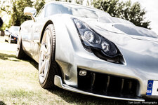
TSP_SC (396 of 191) by TomScottPhoto, on Flickr
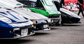
TSP_SC (397 of 191) by TomScottPhoto, on Flickr
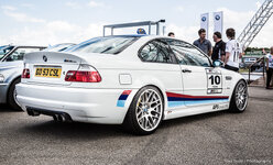
TSP_SC (398 of 191) by TomScottPhoto, on Flickr
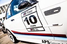
TSP_SC (399 of 191) by TomScottPhoto, on Flickr
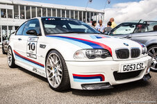
TSP_SC (400 of 191) by TomScottPhoto, on Flickr
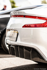
TSP_SC (401 of 191) by TomScottPhoto, on Flickr
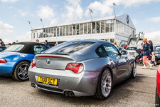
TSP_SC (402 of 191) by TomScottPhoto, on Flickr
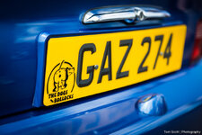
TSP_SC (403 of 191) by TomScottPhoto, on Flickr
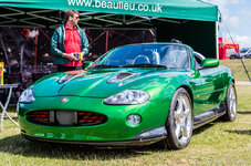
TSP_SC (404 of 191) by TomScottPhoto, on Flickr
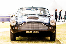
TSP_SC (405 of 191) by TomScottPhoto, on Flickr
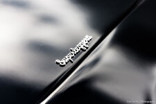
TSP_SC (406 of 191) by TomScottPhoto, on Flickr
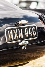
TSP_SC (408 of 191) by TomScottPhoto, on Flickr
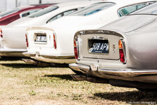
TSP_SC (409 of 191) by TomScottPhoto, on Flickr
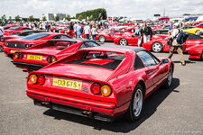
TSP_SC (410 of 191) by TomScottPhoto, on Flickr
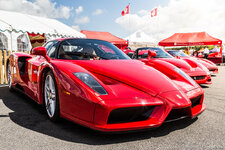
TSP_SC (411 of 191) by TomScottPhoto, on Flickr
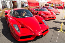
TSP_SC (413 of 191) by TomScottPhoto, on Flickr
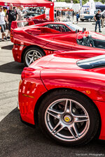
TSP_SC (414 of 191) by TomScottPhoto, on Flickr
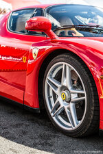
TSP_SC (415 of 191) by TomScottPhoto, on Flickr
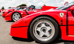
TSP_SC (416 of 191) by TomScottPhoto, on Flickr
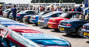
TSP_SC (418 of 191) by TomScottPhoto, on Flickr
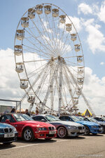
TSP_SC (419 of 191) by TomScottPhoto, on Flickr
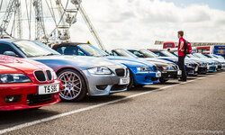
TSP_SC (420 of 191) by TomScottPhoto, on Flickr
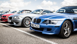
TSP_SC (421 of 191) by TomScottPhoto, on Flickr
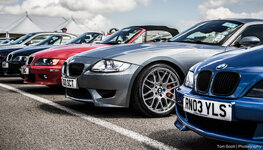
TSP_SC (422 of 191) by TomScottPhoto, on Flickr
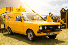
TSP_SC (423 of 191) by TomScottPhoto, on Flickr
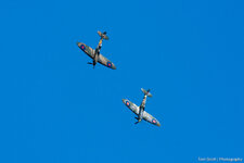
TSP_SC (424 of 191) by TomScottPhoto, on Flickr
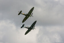
TSP_SC (425 of 191) by TomScottPhoto, on Flickr
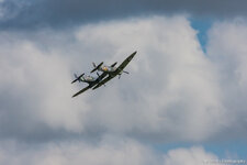
TSP_SC (426 of 191) by TomScottPhoto, on Flickr
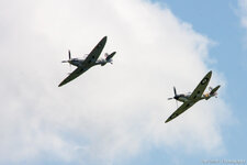
TSP_SC (427 of 191) by TomScottPhoto, on Flickr
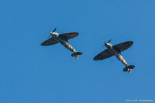
TSP_SC (428 of 191) by TomScottPhoto, on Flickr
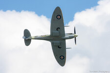
TSP_SC (429 of 191) by TomScottPhoto, on Flickr
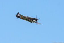
TSP_SC (430 of 191) by TomScottPhoto, on Flickr
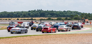
TSP_SC (431 of 191) by TomScottPhoto, on Flickr
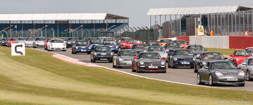
TSP_SC (432 of 191) by TomScottPhoto, on Flickr
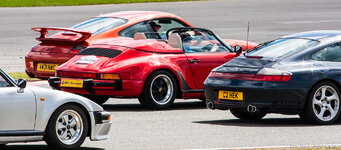
TSP_SC (433 of 191) by TomScottPhoto, on Flickr
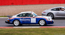
TSP_SC (434 of 191) by TomScottPhoto, on Flickr
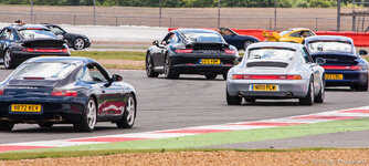
TSP_SC (435 of 191) by TomScottPhoto, on Flickr
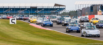
TSP_SC (436 of 191) by TomScottPhoto, on Flickr
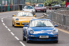
TSP_SC (439 of 191) by TomScottPhoto, on Flickr
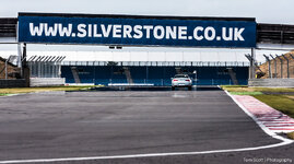
TSP_SC (440 of 191) by TomScottPhoto, on Flickr

TSP_SC (441 of 191) by TomScottPhoto, on Flickr
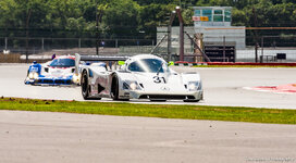
TSP_SC (442 of 191) by TomScottPhoto, on Flickr
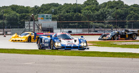
TSP_SC (443 of 191) by TomScottPhoto, on Flickr
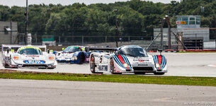
TSP_SC (444 of 191) by TomScottPhoto, on Flickr
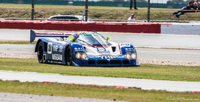
TSP_SC (445 of 191) by TomScottPhoto, on Flickr
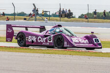
TSP_SC (446 of 191) by TomScottPhoto, on Flickr
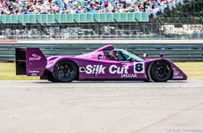
TSP_SC (447 of 191) by TomScottPhoto, on Flickr
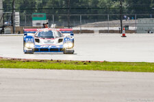
TSP_SC (448 of 191) by TomScottPhoto, on Flickr
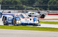
TSP_SC (449 of 191) by TomScottPhoto, on Flickr
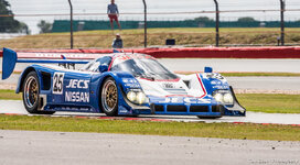
TSP_SC (450 of 191) by TomScottPhoto, on Flickr
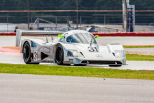
TSP_SC (451 of 191) by TomScottPhoto, on Flickr
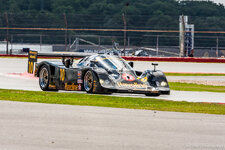
TSP_SC (452 of 191) by TomScottPhoto, on Flickr
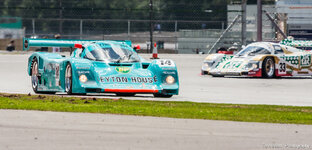
TSP_SC (453 of 191) by TomScottPhoto, on Flickr
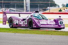
TSP_SC (454 of 191) by TomScottPhoto, on Flickr
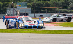
TSP_SC (455 of 191) by TomScottPhoto, on Flickr
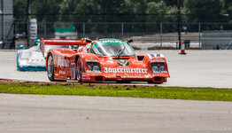
TSP_SC (456 of 191) by TomScottPhoto, on Flickr
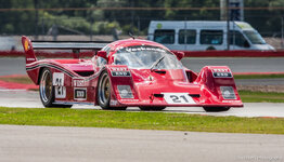
TSP_SC (457 of 191) by TomScottPhoto, on Flickr
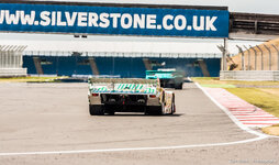
TSP_SC (458 of 191) by TomScottPhoto, on Flickr
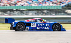
TSP_SC (460 of 191) by TomScottPhoto, on Flickr
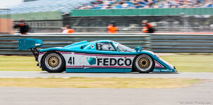
TSP_SC (461 of 191) by TomScottPhoto, on Flickr
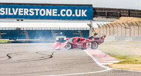
TSP_SC (462 of 191) by TomScottPhoto, on Flickr
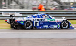
TSP_SC (463 of 191) by TomScottPhoto, on Flickr
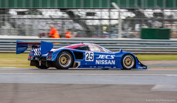
TSP_SC (464 of 191) by TomScottPhoto, on Flickr
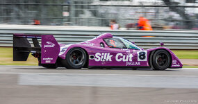
Jaguar XJR-14, No.8, Warwick, Group C Endurance, SIlverstone Classics 2013 by TomScottPhoto, on Flickr
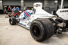
TSP_SC (466 of 191) by TomScottPhoto, on Flickr
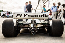
TSP_SC (467 of 191) by TomScottPhoto, on Flickr
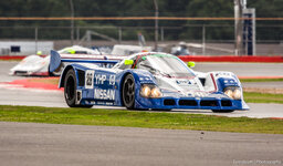
TSP_SC (468 of 191) by TomScottPhoto, on Flickr
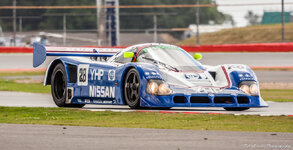
TSP_SC (469 of 191) by TomScottPhoto, on Flickr
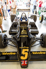
TSP_SC (470 of 191) by TomScottPhoto, on Flickr
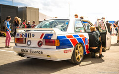
TSP_SC (473 of 191) by TomScottPhoto, on Flickr
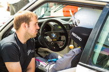
TSP_SC (474 of 191) by TomScottPhoto, on Flickr
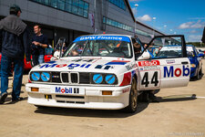
TSP_SC (475 of 191) by TomScottPhoto, on Flickr
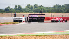
TSP_SC (476 of 191) by TomScottPhoto, on Flickr
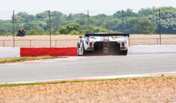
TSP_SC (477 of 191) by TomScottPhoto, on Flickr
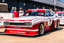
TSP_SC (478 of 191) by TomScottPhoto, on Flickr
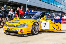
TSP_SC (479 of 191) by TomScottPhoto, on Flickr
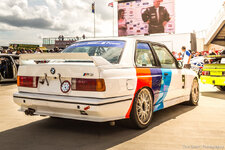
TSP_SC (480 of 191) by TomScottPhoto, on Flickr
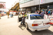
TSP_SC (481 of 191) by TomScottPhoto, on Flickr
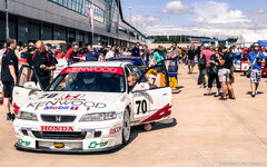
TSP_SC (482 of 191) by TomScottPhoto, on Flickr
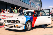
TSP_SC (483 of 191) by TomScottPhoto, on Flickr
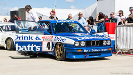
TSP_SC (484 of 191) by TomScottPhoto, on Flickr
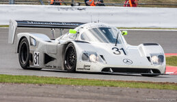
TSP_SC (485 of 191) by TomScottPhoto, on Flickr
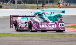
TSP_SC (486 of 191) by TomScottPhoto, on Flickr
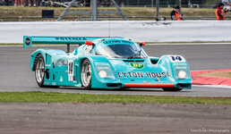
TSP_SC (487 of 191) by TomScottPhoto, on Flickr
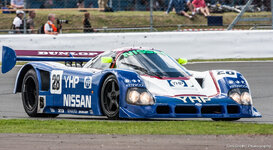
TSP_SC (488 of 191) by TomScottPhoto, on Flickr
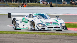
TSP_SC (489 of 191) by TomScottPhoto, on Flickr
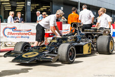
TSP_SC (491 of 191) by TomScottPhoto, on Flickr
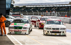
TSP_SC (492 of 191) by TomScottPhoto, on Flickr
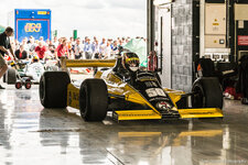
TSP_SC (493 of 191) by TomScottPhoto, on Flickr
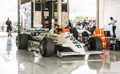
TSP_SC (494 of 191) by TomScottPhoto, on Flickr
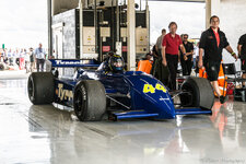
TSP_SC (495 of 191) by TomScottPhoto, on Flickr
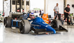
TSP_SC (496 of 191) by TomScottPhoto, on Flickr
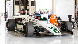
TSP_SC (497 of 191) by TomScottPhoto, on Flickr
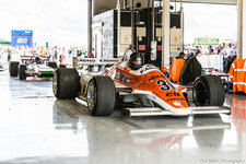
TSP_SC (498 of 191) by TomScottPhoto, on Flickr
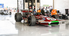
TSP_SC (499 of 191) by TomScottPhoto, on Flickr
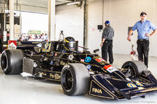
TSP_SC (500 of 191) by TomScottPhoto, on Flickr
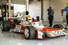
TSP_SC (501 of 191) by TomScottPhoto, on Flickr
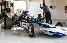
TSP_SC (502 of 191) by TomScottPhoto, on Flickr
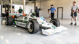
TSP_SC (503 of 191) by TomScottPhoto, on Flickr
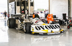
TSP_SC (504 of 191) by TomScottPhoto, on Flickr
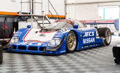
TSP_SC (505 of 191) by TomScottPhoto, on Flickr
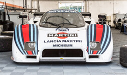
TSP_SC (506 of 191) by TomScottPhoto, on Flickr
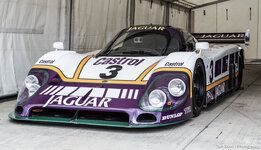
TSP_SC (507 of 191) by TomScottPhoto, on Flickr
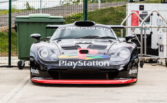
TSP_SC (508 of 191) by TomScottPhoto, on Flickr
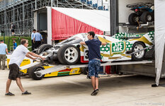
TSP_SC (509 of 191) by TomScottPhoto, on Flickr
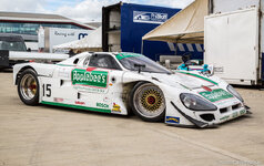
TSP_SC (510 of 191) by TomScottPhoto, on Flickr
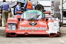
TSP_SC (511 of 191) by TomScottPhoto, on Flickr
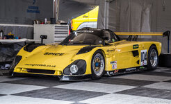
TSP_SC (512 of 191) by TomScottPhoto, on Flickr
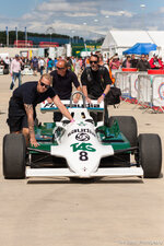
TSP_SC (513 of 191) by TomScottPhoto, on Flickr
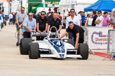
TSP_SC (514 of 191) by TomScottPhoto, on Flickr
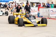
TSP_SC (515 of 191) by TomScottPhoto, on Flickr
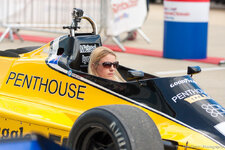
TSP_SC (516 of 191) by TomScottPhoto, on Flickr
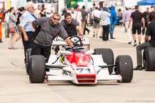
TSP_SC (517 of 191) by TomScottPhoto, on Flickr
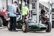
TSP_SC (518 of 191) by TomScottPhoto, on Flickr
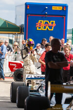
TSP_SC (519 of 191) by TomScottPhoto, on Flickr
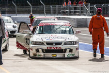
TSP_SC (520 of 191) by TomScottPhoto, on Flickr
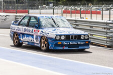
TSP_SC (521 of 191) by TomScottPhoto, on Flickr
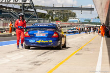
TSP_SC (522 of 191) by TomScottPhoto, on Flickr
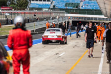
TSP_SC (523 of 191) by TomScottPhoto, on Flickr
We were there very early got right in front of the BMW stand. Light got better through the day sorry for a little repetition I'm sure you don't mind!
Link to the full set
http://www.flickr.com/photos/tomscottphotography/sets/72157635105306341/
TSP_SC (334 of 191) by TomScottPhoto, on Flickr
TSP_SC (337 of 191) by TomScottPhoto, on Flickr
TSP_SC (335 of 191) by TomScottPhoto, on Flickr
TSP_SC (336 of 191) by TomScottPhoto, on Flickr
TSP_SC (338 of 191) by TomScottPhoto, on Flickr
TSP_SC (339 of 191) by TomScottPhoto, on Flickr
TSP_SC (340 of 191) by TomScottPhoto, on Flickr
TSP_SC (341 of 191) by TomScottPhoto, on Flickr
TSP_SC (342 of 191) by TomScottPhoto, on Flickr
TSP_SC (343 of 191) by TomScottPhoto, on Flickr
TSP_SC (344 of 191) by TomScottPhoto, on Flickr
TSP_SC (345 of 191) by TomScottPhoto, on Flickr
TSP_SC (346 of 191) by TomScottPhoto, on Flickr
TSP_SC (347 of 191) by TomScottPhoto, on Flickr
TSP_SC (348 of 191) by TomScottPhoto, on Flickr
TSP_SC (349 of 191) by TomScottPhoto, on Flickr
TSP_SC (350 of 191) by TomScottPhoto, on Flickr
TSP_SC (351 of 191) by TomScottPhoto, on Flickr
TSP_SC (352 of 191) by TomScottPhoto, on Flickr
TSP_SC (353 of 191) by TomScottPhoto, on Flickr
TSP_SC (354 of 191) by TomScottPhoto, on Flickr
TSP_SC (355 of 191) by TomScottPhoto, on Flickr
TSP_SC (356 of 191) by TomScottPhoto, on Flickr
TSP_SC (357 of 191) by TomScottPhoto, on Flickr
TSP_SC (358 of 191) by TomScottPhoto, on Flickr
TSP_SC (359 of 191) by TomScottPhoto, on Flickr
TSP_SC (360 of 191) by TomScottPhoto, on Flickr
TSP_SC (361 of 191) by TomScottPhoto, on Flickr
TSP_SC (363 of 191) by TomScottPhoto, on Flickr
TSP_SC (364 of 191) by TomScottPhoto, on Flickr
TSP_SC (366 of 191) by TomScottPhoto, on Flickr
TSP_SC (367 of 191) by TomScottPhoto, on Flickr
TSP_SC (369 of 191) by TomScottPhoto, on Flickr
TSP_SC (370 of 191) by TomScottPhoto, on Flickr
TSP_SC (371 of 191) by TomScottPhoto, on Flickr
TSP_SC (373 of 191) by TomScottPhoto, on Flickr
TSP_SC (374 of 191) by TomScottPhoto, on Flickr
TSP_SC (376 of 191) by TomScottPhoto, on Flickr
TSP_SC (378 of 191) by TomScottPhoto, on Flickr
TSP_SC (380 of 191) by TomScottPhoto, on Flickr
TSP_SC (381 of 191) by TomScottPhoto, on Flickr
TSP_SC (382 of 191) by TomScottPhoto, on Flickr
TSP_SC (383 of 191) by TomScottPhoto, on Flickr
TSP_SC (384 of 191) by TomScottPhoto, on Flickr
TSP_SC (385 of 191) by TomScottPhoto, on Flickr
TSP_SC (386 of 191) by TomScottPhoto, on Flickr
TSP_SC (387 of 191) by TomScottPhoto, on Flickr
TSP_SC (388 of 191) by TomScottPhoto, on Flickr
TSP_SC (389 of 191) by TomScottPhoto, on Flickr
TSP_SC (390 of 191) by TomScottPhoto, on Flickr
TSP_SC (391 of 191) by TomScottPhoto, on Flickr
TSP_SC (392 of 191) by TomScottPhoto, on Flickr
TSP_SC (393 of 191) by TomScottPhoto, on Flickr
TSP_SC (394 of 191) by TomScottPhoto, on Flickr
TSP_SC (395 of 191) by TomScottPhoto, on Flickr
TSP_SC (396 of 191) by TomScottPhoto, on Flickr
TSP_SC (397 of 191) by TomScottPhoto, on Flickr
TSP_SC (398 of 191) by TomScottPhoto, on Flickr
TSP_SC (399 of 191) by TomScottPhoto, on Flickr
TSP_SC (400 of 191) by TomScottPhoto, on Flickr
TSP_SC (401 of 191) by TomScottPhoto, on Flickr
TSP_SC (402 of 191) by TomScottPhoto, on Flickr
TSP_SC (403 of 191) by TomScottPhoto, on Flickr
TSP_SC (404 of 191) by TomScottPhoto, on Flickr
TSP_SC (405 of 191) by TomScottPhoto, on Flickr
TSP_SC (406 of 191) by TomScottPhoto, on Flickr
TSP_SC (408 of 191) by TomScottPhoto, on Flickr
TSP_SC (409 of 191) by TomScottPhoto, on Flickr
TSP_SC (410 of 191) by TomScottPhoto, on Flickr
TSP_SC (411 of 191) by TomScottPhoto, on Flickr
TSP_SC (413 of 191) by TomScottPhoto, on Flickr
TSP_SC (414 of 191) by TomScottPhoto, on Flickr
TSP_SC (415 of 191) by TomScottPhoto, on Flickr
TSP_SC (416 of 191) by TomScottPhoto, on Flickr
TSP_SC (418 of 191) by TomScottPhoto, on Flickr
TSP_SC (419 of 191) by TomScottPhoto, on Flickr
TSP_SC (420 of 191) by TomScottPhoto, on Flickr
TSP_SC (421 of 191) by TomScottPhoto, on Flickr
TSP_SC (422 of 191) by TomScottPhoto, on Flickr
TSP_SC (423 of 191) by TomScottPhoto, on Flickr
TSP_SC (424 of 191) by TomScottPhoto, on Flickr
TSP_SC (425 of 191) by TomScottPhoto, on Flickr
TSP_SC (426 of 191) by TomScottPhoto, on Flickr
TSP_SC (427 of 191) by TomScottPhoto, on Flickr
TSP_SC (428 of 191) by TomScottPhoto, on Flickr
TSP_SC (429 of 191) by TomScottPhoto, on Flickr
TSP_SC (430 of 191) by TomScottPhoto, on Flickr
TSP_SC (431 of 191) by TomScottPhoto, on Flickr
TSP_SC (432 of 191) by TomScottPhoto, on Flickr
TSP_SC (433 of 191) by TomScottPhoto, on Flickr
TSP_SC (434 of 191) by TomScottPhoto, on Flickr
TSP_SC (435 of 191) by TomScottPhoto, on Flickr
TSP_SC (436 of 191) by TomScottPhoto, on Flickr
TSP_SC (439 of 191) by TomScottPhoto, on Flickr
TSP_SC (440 of 191) by TomScottPhoto, on Flickr
TSP_SC (441 of 191) by TomScottPhoto, on Flickr
TSP_SC (442 of 191) by TomScottPhoto, on Flickr
TSP_SC (443 of 191) by TomScottPhoto, on Flickr
TSP_SC (444 of 191) by TomScottPhoto, on Flickr
TSP_SC (445 of 191) by TomScottPhoto, on Flickr
TSP_SC (446 of 191) by TomScottPhoto, on Flickr
TSP_SC (447 of 191) by TomScottPhoto, on Flickr
TSP_SC (448 of 191) by TomScottPhoto, on Flickr
TSP_SC (449 of 191) by TomScottPhoto, on Flickr
TSP_SC (450 of 191) by TomScottPhoto, on Flickr
TSP_SC (451 of 191) by TomScottPhoto, on Flickr
TSP_SC (452 of 191) by TomScottPhoto, on Flickr
TSP_SC (453 of 191) by TomScottPhoto, on Flickr
TSP_SC (454 of 191) by TomScottPhoto, on Flickr
TSP_SC (455 of 191) by TomScottPhoto, on Flickr
TSP_SC (456 of 191) by TomScottPhoto, on Flickr
TSP_SC (457 of 191) by TomScottPhoto, on Flickr
TSP_SC (458 of 191) by TomScottPhoto, on Flickr
TSP_SC (460 of 191) by TomScottPhoto, on Flickr
TSP_SC (461 of 191) by TomScottPhoto, on Flickr
TSP_SC (462 of 191) by TomScottPhoto, on Flickr
TSP_SC (463 of 191) by TomScottPhoto, on Flickr
TSP_SC (464 of 191) by TomScottPhoto, on Flickr
Jaguar XJR-14, No.8, Warwick, Group C Endurance, SIlverstone Classics 2013 by TomScottPhoto, on Flickr
TSP_SC (466 of 191) by TomScottPhoto, on Flickr
TSP_SC (467 of 191) by TomScottPhoto, on Flickr
TSP_SC (468 of 191) by TomScottPhoto, on Flickr
TSP_SC (469 of 191) by TomScottPhoto, on Flickr
TSP_SC (470 of 191) by TomScottPhoto, on Flickr
TSP_SC (473 of 191) by TomScottPhoto, on Flickr
TSP_SC (474 of 191) by TomScottPhoto, on Flickr
TSP_SC (475 of 191) by TomScottPhoto, on Flickr
TSP_SC (476 of 191) by TomScottPhoto, on Flickr
TSP_SC (477 of 191) by TomScottPhoto, on Flickr
TSP_SC (478 of 191) by TomScottPhoto, on Flickr
TSP_SC (479 of 191) by TomScottPhoto, on Flickr
TSP_SC (480 of 191) by TomScottPhoto, on Flickr
TSP_SC (481 of 191) by TomScottPhoto, on Flickr
TSP_SC (482 of 191) by TomScottPhoto, on Flickr
TSP_SC (483 of 191) by TomScottPhoto, on Flickr
TSP_SC (484 of 191) by TomScottPhoto, on Flickr
TSP_SC (485 of 191) by TomScottPhoto, on Flickr
TSP_SC (486 of 191) by TomScottPhoto, on Flickr
TSP_SC (487 of 191) by TomScottPhoto, on Flickr
TSP_SC (488 of 191) by TomScottPhoto, on Flickr
TSP_SC (489 of 191) by TomScottPhoto, on Flickr
TSP_SC (491 of 191) by TomScottPhoto, on Flickr
TSP_SC (492 of 191) by TomScottPhoto, on Flickr
TSP_SC (493 of 191) by TomScottPhoto, on Flickr
TSP_SC (494 of 191) by TomScottPhoto, on Flickr
TSP_SC (495 of 191) by TomScottPhoto, on Flickr
TSP_SC (496 of 191) by TomScottPhoto, on Flickr
TSP_SC (497 of 191) by TomScottPhoto, on Flickr
TSP_SC (498 of 191) by TomScottPhoto, on Flickr
TSP_SC (499 of 191) by TomScottPhoto, on Flickr
TSP_SC (500 of 191) by TomScottPhoto, on Flickr
TSP_SC (501 of 191) by TomScottPhoto, on Flickr
TSP_SC (502 of 191) by TomScottPhoto, on Flickr
TSP_SC (503 of 191) by TomScottPhoto, on Flickr
TSP_SC (504 of 191) by TomScottPhoto, on Flickr
TSP_SC (505 of 191) by TomScottPhoto, on Flickr
TSP_SC (506 of 191) by TomScottPhoto, on Flickr
TSP_SC (507 of 191) by TomScottPhoto, on Flickr
TSP_SC (508 of 191) by TomScottPhoto, on Flickr
TSP_SC (509 of 191) by TomScottPhoto, on Flickr
TSP_SC (510 of 191) by TomScottPhoto, on Flickr
TSP_SC (511 of 191) by TomScottPhoto, on Flickr
TSP_SC (512 of 191) by TomScottPhoto, on Flickr
TSP_SC (513 of 191) by TomScottPhoto, on Flickr
TSP_SC (514 of 191) by TomScottPhoto, on Flickr
TSP_SC (515 of 191) by TomScottPhoto, on Flickr
TSP_SC (516 of 191) by TomScottPhoto, on Flickr
TSP_SC (517 of 191) by TomScottPhoto, on Flickr
TSP_SC (518 of 191) by TomScottPhoto, on Flickr
TSP_SC (519 of 191) by TomScottPhoto, on Flickr
TSP_SC (520 of 191) by TomScottPhoto, on Flickr
TSP_SC (521 of 191) by TomScottPhoto, on Flickr
TSP_SC (522 of 191) by TomScottPhoto, on Flickr
TSP_SC (523 of 191) by TomScottPhoto, on Flickr
Great photos Tom
I had to laugh though at photo 382 where that Cayman S is trying to sneak into the 911 parade lap!!
I had to laugh though at photo 382 where that Cayman S is trying to sneak into the 911 parade lap!!
