>

Android Auto Coolwalk

AnubisZed

Senior member
Lincolnshire, UK
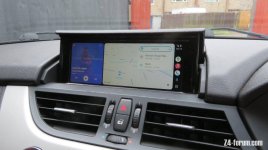
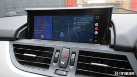
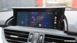
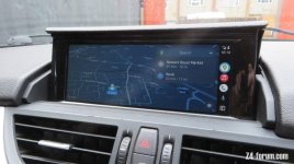
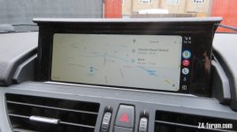
For those of you with an MMI box attached to your iDrive system and are running Android Auto, I thought I'd share a few photos of the new Coolwalk screen and how it looks. Mine is runing through my Mr12volt box, so I'm not sure if it's supporting all mmi boxes yet.

I'm quite impressed with the new layout but it's a bit different in how it works so I'm getting used to it, alas I've not been out in it recently since it apperared on mine.
 

Attachments

  • IMG_2234.JPG
    IMG_2234.JPG
    97.1 KB · Views: 236
  • IMG_2235.JPG
    IMG_2235.JPG
    98.7 KB · Views: 236
  • IMG_2236.JPG
    IMG_2236.JPG
    98 KB · Views: 236
  • IMG_2237.JPG
    IMG_2237.JPG
    101.7 KB · Views: 236
  • IMG_2238.JPG
    IMG_2238.JPG
    91.3 KB · Views: 236
There's a lot of Love in those pictures Dave. :erm:
Can't wait to install mine, currently queued 4th in weekend project lists...
 
Christopher72 said:
There's a lot of Love in those pictures Dave. :erm:
Can't wait to install mine, currently queued 4th in weekend project lists...
There's always love in my work :thumbsup:
 
Silverstar said:
The layout looks very similar to Apple Car Play.
I've always prefered the look of Apple's CarPlay layout, but not that you can't skip from one section to another, instead you have to scroll all the way. With AA you can skip sections which is much easier, IMHO :thumbsup: For instance in the last picture above, if I had the play button highlighted (which is what I do all the time while driving anyway), if I wanted to go over to the menu button (multiple dots, far right, bottom one) then in CarPlay i'd have to scroll to the Skip Forward button, then onto the map and the Search button, then the Newark would be highlighted, then Work, then Settings, then it would go to the Google Map icon (on the side bar), then down to Apple Music, Phone, Hey Google and then finally onto the Menu option. Now with AA you simply flick to the right twice (Map and then right side bar) and scroll down, or if you'd been there previousley it would highlight the Menu straightaway. It's the little things that make all the difference :thumbsup:
 
AnubisZed said:
Silverstar said:
The layout looks very similar to Apple Car Play.
I've always prefered the look of Apple's CarPlay layout, but not that you can't skip from one section to another, instead you have to scroll all the way. With AA you can skip sections which is much easier, IMHO :thumbsup: For instance in the last picture above, if I had the play button highlighted (which is what I do all the time while driving anyway), if I wanted to go over to the menu button (multiple dots, far right, bottom one) then in CarPlay i'd have to scroll to the Skip Forward button, then onto the map and the Search button, then the Newark would be highlighted, then Work, then Settings, then it would go to the Google Map icon (on the side bar), then down to Apple Music, Phone, Hey Google and then finally onto the Menu option. Now with AA you simply flick to the right twice (Map and then right side bar) and scroll down, or if you'd been there previousley it would highlight the Menu straightaway. It's the little things that make all the difference :thumbsup:

That's interesting although for various reasons you will never pry me away from my Apple devices no matter how much easier scrolling on AA is :rofl:

For me if I am in the same position as you mentioned I just hit the menu button on the iDrive controller and hey presto I am there or I just use Siri and say open Waze e.g. Also I find it easier with the layout set to LHD cars rather than for RHD in CarPlay.
 
Back
Top Bottom